> Dowload new HP logo vector here
Established in 1939 by Bill Hewlett and Dave Packard, HP (shorthand for Hewlett Packard, just for the record) is, as it describes itself a “technology company” selling consumer products for printing (shipping more than 1 million printers a week!), personal computing (48 million units a year), and software, as well as offering IT infrastructure and other related services. Ranked 11 in the Fortune 500, HP counts with 324,600 employees across 170 countries and generated $127.2 billion in revenue in 2011. Clearly, HP is big but, also, it lacks that je ne sais quoi that transforms a massive company into a revered brand like, oh, I don’t know, Apple. With the help of Moving Brands, HP hopes to transform its perception and introduce a whole new way of portraying the company. Maybe.
First, the good news: Moving Brands has posted a fantastic and detailed case study of their work here and I highly recommend reading every bit and watching every video as it shows very well what a rebranding of this size entails.
Second, the bad news: The new logo is not yet implemented by HP. It might. It might not. I am told HP is in charge of its implementation and decision for when and how. And that that’s all there is to know.
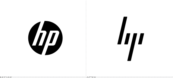
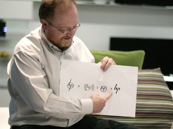
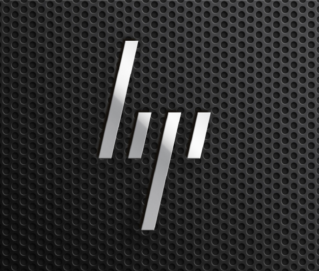
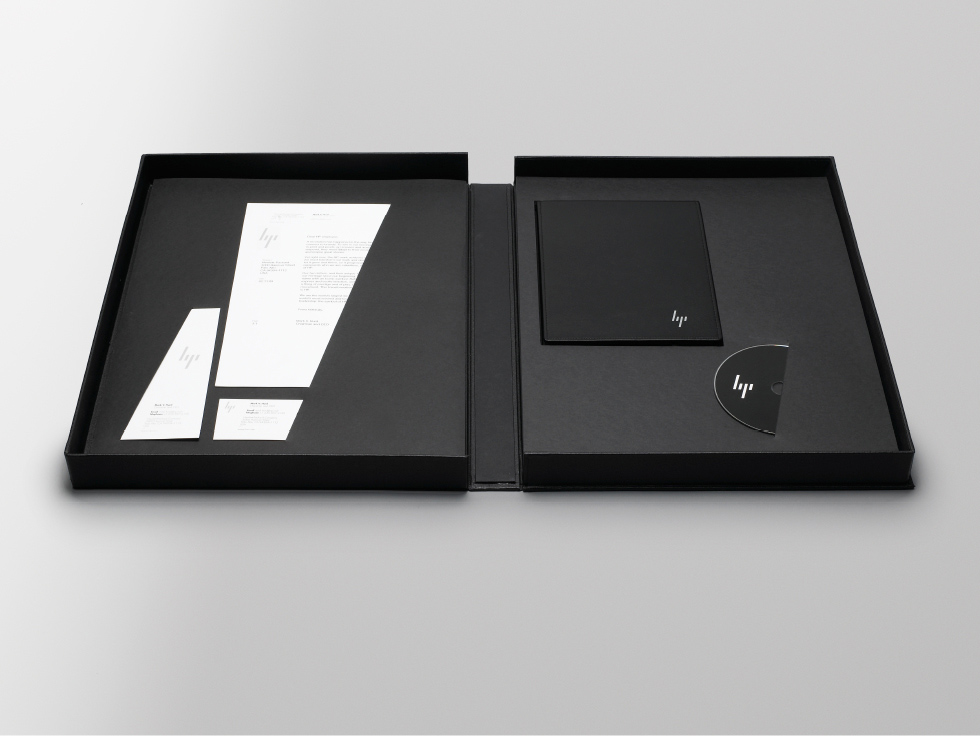
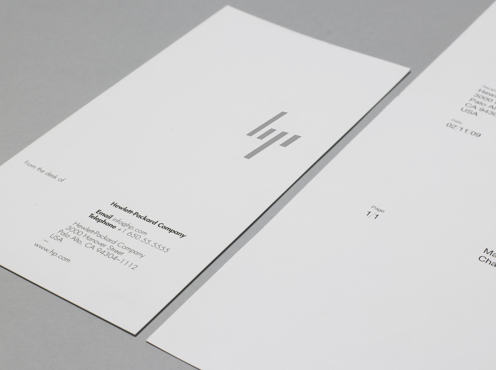
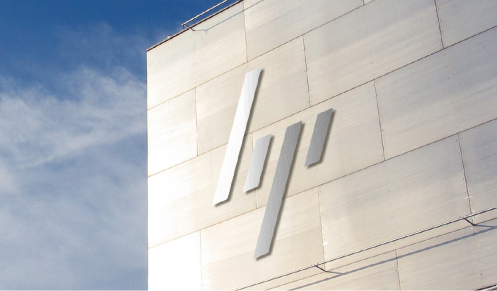
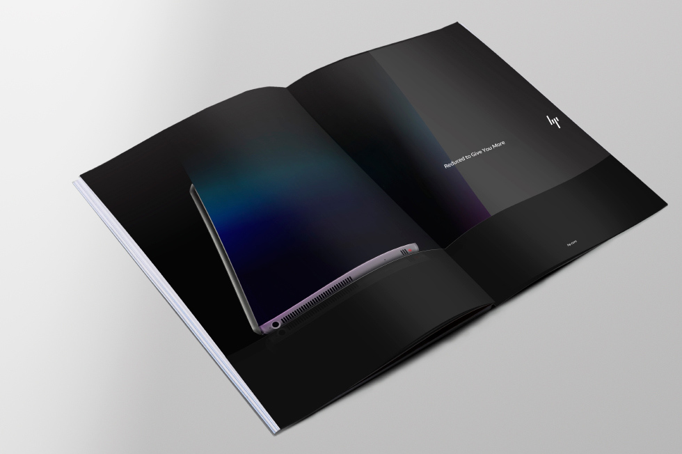
So there is a couple of parts to this project. The first is the hope: how the new HP logo came to be, how it looks and what its application might one day be. The second is the current reality: An application of all the new visual and personality attributes applied to the existing logo — a sort of brand purgatory but with nice animations and a bespoke typeface.
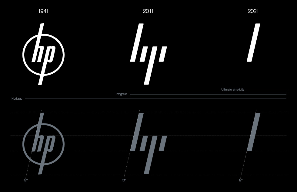
The defining signature of the system is the 13° angle. 13° represents HP’s spirit as a company, driven forward by ingenuity and optimism about the future and a belief in human progress. It also refers to the world of computing by recalling the forward slash used in programming. 13° exists within the brand identity, in the graphic language, product design and UI.
— Moving Brands
Source: Underconsideration.com


