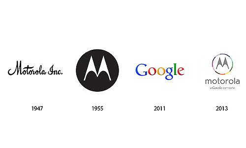
Old and New Motorola logo

Mergers and acquisitions have been common in the past. Companies have acquired others in order to enhance their selling and profits. When companies do that, there is a direct impact on their buying and selling policies, management, strategies and finances. Companies then must learn to adopt different strategies which benefit them in future. Whenever there is an acquisition, a company takes over nearly 100% of another company, whereas in mergers, companies join together and distribute shares among each other.
• The Company’s Establishment
Motorola was formed in 1928 mainly for the purpose of designing and manufacturing consumer products. These included cable TV boxes which were common those days. Later the company started making cellular phones which were transformed into high technology Smart Phones. It was in the decade of 2000s that the company was broken into two different companies. One was called Motorola Solutions and the other was Motorola Mobility. The former offer services to governmental organizations and enterprises whereas the latter fulfills customers’ needs. Motorola Mobility even started making smart phones to meet the increasing demand of the phones.
• Google and Motorola

Google took over Motorola in 2012 to enhance smart phone capabilities. The company sought to merge its Android OS with Motorola’s hardware. It happened because Motorola was an expert of making devices whereas Google’s Android software had its own class. Motorola is long famous for its communication’s involvement in high-tech technology. This move was done because both companies planned to provide better and cheap phones to the public. Google made a deal of $12.5 billion with Motorola last year and took over the company.
• The New Motorola

Last week, during a press conference of US Tech Week, the new logo of Motorola was revealed. The design features a grey colored “M” of the company, a circle around “M” of different colors, the brand name “Motorola” in lower case and in grey color and the name “a Google company” written underneath it. The design has a new typeface. Previously it was bold, italicized and capitalized mark in a soft tone. The type chosen is in lower case format. The circle has different colors which probably have been kept according to “Google’s” color theme.
To sum up, Google has all plans to make mark in Cellular industry which is a good sign. The new logo reveals that there is a lot which is yet to come. So we wish Google and Motorola best of luck.


