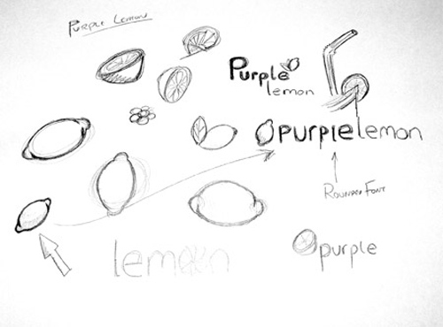
Your logo is going to be associated with your business or company, so you need to ensure that it is appealing and liked by all. There are many ways to make your logo look different and more appealing from any other ordinary logo.

Simplicity
Look around for the logos of all popular and successful brands and you will notice that most of them are simple, yet appealing. Simple logos are easy to remember, impressive, and soothe the eyes of the viewer. Try not to make it gaudy or detailed.
Aspect Ratio
A logo that has the right proportion is visually pleasing and appealing. Avoid making it too tall, wide, or short. Ensure that the logo will not look odd when enlarged, or reduced in size. Also, use a simple graphic that is scalable.
Readability
If you include text in your logo, then make sure it is readable, and choose not more than two fonts. Ensure to use the right fonts, make them distinct, and avoid overlapping or intertwining them with the icon of the logo. Try not to clutter your logo by keeping the tagline separate.
Color
Your logo should look equally appealing whether it is in black and white, grayscale or color format. Choose your colors carefully, by selecting the colors that are in the CMYK range, Pantone spot color equivalents, or printable WEB safe colors, to keep the appeal of your logo in printed format. Avoid using more than three colors.
Unique
Try to be different and make a distinct identity. Develop a logo that is not trendy, but timeless and retains its appeal forever. Remember that your logo might be used at a multi-cultural and multi-lingual place, so design a logo that has a universal expression, ensuing in its appeal to a larger audience.
By taking care of these factors your logo will surely appeal more and look better.


