The veterans of the logo design industry have achieved their success for a reason. Sure, it’s partially due to the years of practice, blood, sweat, tears and inky fingers. But mainly, it’s because they stuck to the ten solid-gold principles of world class logo design.
Bonus trivia: can you guess which logo the image for this post is taken from? It ain’t that hard, but you still get a cookie for getting it right, just because we’re fans of yours.
1. Ensure a thorough design brief is received – David Airey
As with all design projects, the brief outlines the plans, desires and expected outcomes of the job. With logo design, the design brief is a valuable piece of documentation which directs the designer towards the correct goal.
David Airey, a well known logo designer from Ireland says:
A solid logo design brief ensures that no time is wasted, and that you receive targeted logo options as soon as possible. The logo brief also helps me focus my attention on the areas that best serve your business, making you much happier with the final result.
When you’re dealing with a graphic or logo design project, it’s vital to write a detailed design brief at the very beginning. There are two main reasons for this:
Firstly, it ensures that you, as a business owner or in-house manager know exactly what you want to achieve from your project.
Second, the brief acts as a point of reference for designers, giving them key points to focus on.

2. Research the client’s industry – Jon Sandruck
A comprehensive knowledge of the client’s business and industry plays a key role in the creation of a logo that not only portrays the correct message, but also helps the client stand out in their sector.
Jon Sandruck is a freelance graphic designer living and working in Dallas/Fort Worth Metroplex. In his article on the creation of the Alliance Business Insurance logo, his research into the company led to a well-targeted idea for the logo design:
It struck me that a big part of what an insurance company like Alliance provide their customers is assembling the best mix of products for their clients…or build an Alliance. To that end, I focused on the idea of assembling multiple pieces into a whole.
Because the company’s name is Alliance, and the capital A is a triangle, and the triangle is THE most visually stable shape, and stability is a key attribute in the insurance industry, I decided to focus on icons that formed the letter A.
3. Use a sketchpad to quickly flesh out initial ideas – Dainis Graveris
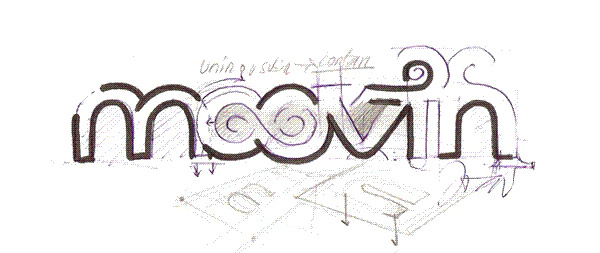
With computers being the centre of all design in the modern world it is often easy to get stuck in with the digital creation, although this sometimes results in a vague direction for the logo design process. Sketching out initial ideas can help you quickly consider and review various ideas.
Dainis Graveris is a designer from Latvia. In his Logo Creation Process article, he talks about the use of inspirational sketching:
Sketching isn’t time consuming and is a really good way to put your ideas from your head right on the paper. After that it’s always easier to actually design it on the computer. Sketching helps to evolve your imagination – once you understand it, you always will start from just white paper.
4. Design the logo to work in a single color – Patrick Winfield
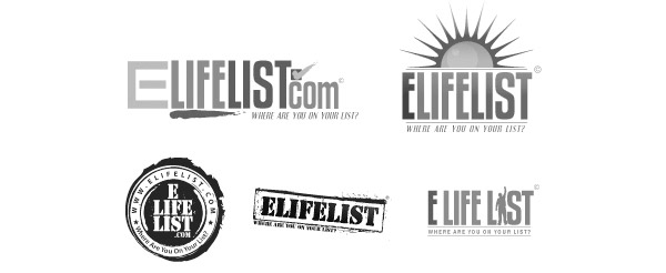
Logos are used in a huge range of environments, some of which require the logo to be reproduced at small scale or in limited colors, therefore it is important to ensure that the logo design works in mono format.
As an author of the 10e20 blog Patrick Winfield shares his inspirations and ideas with his readers. In his article, The Logo Design Process, from Concept to Completion he deals with the topic of color in design:
I like to work first in black and white to ensure that the logo will look good in its simplest form. Color is very subjective and emotional. This can distract from the overall design- say if you saw your logo in all red that color may be the first thing that you respond to and not the composition of the design elements. I will not even consider submitting color suggestions to a client for review until they have signed off on a final black and white logo.
5. Create the logo in vector format – Chris Spooner
Vector applications such as Adobe Illustrator create artwork based on mathematical equations, whereas raster based applications such as Adobe Photoshop rely on the underlying pixels of the document. In order for a logo design to be scaled without the quality of the imagery being affected the logo must be in vector format.
Chris Spooner is a freelance graphic and web designer. In his article ‘How to Design a Logotype from Conception to Completion’ he talks about the need for vector graphics in logo design:
Always design your logos in a vector application such as Adobe Illustrator, rather than a raster application such as Photoshop, the reason being the logo must be scalable without losing quality and needs to appear crisp when printed on anything from business cards to 20ft vinyl banners.
6. Present only the best concepts to the client – Angela Ferraro-Fanning
Once a range of design concepts have been created, it is time to select the best examples for presentation to the client for review. This stage is a halfway point in the overall process and determines whether the project is on the right track.
Angela Ferraro-Fanning, the owner of 13thirtyone talks about some of her processes in her walkthrough of the logo creation for shoe boutique; Kick:
It is my policy when working on a client’s logo that I present them with three concepts. I try to create three entirely different looks while utilizing the three different types of logo formats: just type, image only, and a combination of both. Just because my client sees three logos though, doesn’t mean that’s all it takes. With Kick’s logo conception, I literally created 35 different logo ideas.

In choosing the logo designs for Kick to consider, I first have to decide which ones I truly feel are my best work. It is important that I present clients with pieces that I’d feel happy about showing in my portfolio. Work that is published is work that will be seen by prospective clients as well. Therefore, I must be sure each concept given to the client is of the utmost quality.
7. Show how the logo would work in context – Veerle Pieters
A logo can be used for a range of purposes, from business stationery to vehicle graphics. Knowing the proposed use of a clients logo can help tailor the concepts to give a preview of how they would work in context.
Veerle Pieters is a graphic/web designer living in Belgium and one half of the design team Duoh! In a recent blog article she outlined the process of her logo design for Scroll magazine:
Since this logo’s main purpose is to fit on the cover of a magazine I thought I’d present it to my client using a fictive cover photo. Depending on the cover illustration or photo I thought of using the logo either in black or in white.

8. Keep it Simple (Stupid) – Jeff Fisher
A popular principle in the world of design is the acronym KISS, which stands for Keep It Simple, Stupid. The idea being to aim towards simplicity in a design rather than unnecessary complexity.
Master logo designer and book author Jeff Fisher makes some in depth points on the use of simplicity in logo design:
While in college in the mid-70′s an instructor introduced me to the K.I.S.S. Principle of design; which translates to: Keep It Simple, Stupid. It does convey a very important design consideration. Simple logos are often easily recognized, incredibly memorable and the most effective in conveying the requirements of the client. A refined and distilled identity will also catch the attention of a viewer zipping by signage at 70 miles per hour, on packaging on the crowded shelves of a store, or in any other vehicle used for advertising, marketing and promotion. Remember, the basis of the hugely effective international branding for the world’s largest shoe manufacturer is a very simple graphic swoosh.

9. Make educated choices when it comes to color – Ryan Nichols
Color is one of the key aspects of any design, the psychology and impressions that each color gives can dramatically alter the message and overall appeal of a design. With logo design being closely related to presenting key values, color choice is of high importance.
Ryan Nichols worked as Creative Director during the branding of the popular Future of Web conferences from Carsonified. In an in-depth article exposing the process behind the branding project he talks about the color choices behind the FOWA, FOOA and FOWD conferences:
We believe color is a very important communicator. It contributes a lot to the tone and intended message of a brand. From the information we gathered in the design strategy phase, I knew that we wanted to create a palette that had some energy and boldness to stand out against the bland competitors. Our first step was to put together a mood board to take a look at some palettes that had this quality.
Eventually, we decided on using a single energetic color for each conference paired with a conservative chocolate brown. This would give each brand a fresh look, while the brown balanced it and kept it from being too wild or energetic. This also allowed the brown to act as a unifying thread throughout the conferences, effectively tying them all together.

10. Rebrand with care – David Turner, Michael Bierut
Logos should be designed to avoid trends, making them timeless pieces of design that will look great today or years in the future. Every now and again however a brand needs a refresh. Two popular rebrands of this year include Metallica and Saks Fifth Avenue. It is of utmost importance when rebranding to pay particular attention to the history and established views of the original design, especially when taking into consideration brands such as Metallica, who have a die hard fan club to please who may have the original logo tattooed on their arm!
David Turner was the designer behind the Metallica rebranding, whose studio Turner Duckworth also worked on the famous Coca Cola rebrand and designed the logo for Amazon. During an interview on his thoughts behind the Metallica logo he says:
The logo itself was a big deal and it convinced me that we were a good fit with Metallica. We looked at their history, how they’d adapted a logo they’d originally created, but it had been taken beyond recognition. It runs parallel to the Coke identity work we did where people had designed the soul out of it. Lars said that he would love it if we would look at the old logo and see if there was something in it; an authentic quality to it. The interesting thing was, once we put the logo on the web, the response from fans was great. It’s very important to them. And there’s an iconic M that works with the title of the new album. It all fits together.
Similarly, Michael Bierut, partner of Pentagram, talks about the research into the history of the Saks Fifth Avenue brand and takes inspiration from the original logos:
Examining their history we found the store had used literally dozens of logos since its founding. Of these, one stood out, the logo drawn in 1973 by Tom Carnese, adapted from a signature introduced almost twenty years before. In many people’s minds, this still was the Saks logo.
But simply reinstating a 30-year-old logo wouldn’t be enough. Saks was happy to emphasize its heritage, but it was even more eager to signal that it was looking to the future, a place of constant change and surprise with a consistent dedication to quality.

Suorce: tutsplus.com


