It is said that redesigning a logo is more difficult than creating a new one. Have you ever wondered why it is so? Well, there are two core reasons for this conundrum. To begin with, a logo redesign is accompanied by a longstanding reputation of the previous brand identity. While in the case of a new logo design, there is no prior visual constancy to protect. Secondly, logo redesigns require more marketing efforts to be communicated across the target market.
The strength of a brand identity is visible through its longstanding logo design. The steadier your identity is, the more your brand will flourish. But a logo can only remain steadfast if it continues to impress the customers. However, recent logo design trends have shown consumer behavior to be erratic and unpredictable. That is why several firms adopt a logo redesign to stay current with the tastes and preferences of their customers.
It has been only a couple of months in 2012 but we have witnessed quite a few famous brands redesign their logo. Let us take a brief recap of the first 5 logo redesigns of famous brands in 2012
1. American Red Cross Logo Redesign
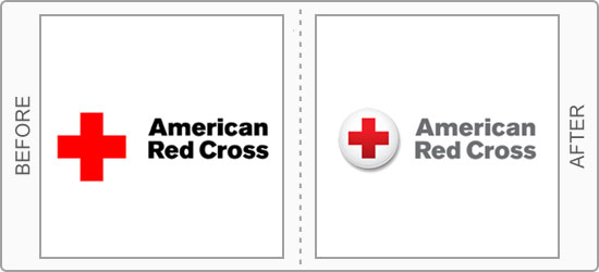
One of the most renowned symbols to be seen at emergency or disaster situations is the Red Cross. Formally named American Red Cross, it is one of the many organizations that have adopted a literal logo for its corporate identity. After decades of using the ‘first-aid style’ symbol, Red Cross has finally redesigned its logo this year to a more dynamic and active icon. The Red Cross symbol is now encircled in a white badge style circle.
2. Windows 8 Logo Redesign
One of the most talked about logo redesign of 2012 is Windows 8 logo. It has been a longstanding trend of Microsoft to introduce a new logo along with every new version of its Windows operating system. This year, the anticipated release of Windows 8 has been coupled with a totally unusually revamp of their famous multi-color logo design. The new identity, designed by Pentagram partner Paula Scher, is a plain blue Windows symbol using the International Typographic Style (or Swiss design).
– Download Window 8 logo vector
3. Jaguar Logo Redesign
The Jaguar is a British car manufacturing company whose logo is another example of literal logo. Depicting a Jaguar leaping over the typeface, the old logo consisted of only a silhouette of the animal. But the logo redesign brings new life into the identity by giving the Jaguar a metallic touch. The new logo appeared in a marketing campaign launched by creative agency Spark44. According to creative professionals, the remarkable change in the symbol after 40 years signifies a more “leaper” and “growler” Jaguar.
– Download Jaguar 2012 logo vector
4. JCPenny Logo Redesign
JCPenny is a renowned US departmental store that was established in 1902. Its logo design has been modified quite a few times over the recent years. Before the launch of a new logo design in January 2012, the last revamp look place last year in 2011. However this year, JCPenny has tried to infuse a more patriotic spirit into its corporate identity by adding blue color in its design.
5. Dulux Logo Redesign
Did you ever stop to notice that world’s most recognized Paint Company had a logo with no colors? Yes that’s right…I’m referring to the former British paint brand Dulux. Its previous logo was a simple logo in Italic fonts and a dark blue shade. But this year, Dulux finally decided to add some colors into their logo design. The new identity features a colourful wave with the tagline “Let’s Color”.
What’s Your Verdict?
Having witnessed the first of the logo redesigns of 2012, what is your verdict on them? Do you think they were necessary or some are just a waste of time?
[Via: LogoBlog]
– After reading this article, people also read: Successful and Failed logo Redesigns
