A company’s logo is the most powerful part of their corporate identity. Logos communicate with consumers and users on a personal level, affecting the market’s opinions towards the brand on a psychological level. Sometimes, logos need a makeover. It takes a lot of research to be able to execute a redesign of an old and familiar logo.
Underdogs can get on top of the game because of their logo transformation and at the same time a major player can destroy themselves in just a short time. Here are a few of the most successful and not-so-successful logo redesigns. Let’s cover the good ones first.
Amazing Logo Redesigns
1. Kentucky Fried Chicken

Kentucky Fried Chicken, also known as KFC, is a chain of restaurants based in humble Louisville, Kentucky. The famous restaurant was founded by Colonel Harland Sanders. Colonel died in 1980 but still continues to be an important part of its branding and advertising strategy. The restaurant is most well-known for their famous fried chicken. KFC has changed its logo four times in forty years, and with each redesign it becomes more and more about Colonel Sanders.
The new logo is fresh, it’s distinctly new but it’s still all about the colonel. It made use of bolder colors and lines, so it’s more visually striking. Plus, the colonel has gotten rid of the stuffy suit and has put on a homey apron. The restaurant looks very friendly for the kids and the family. I think that the new logo can do without the KFC typeface, however.
2. Starbucks

Starbucks is a well-loved brand internationally, best known for their great coffee that is distinctly ‘Starbucks coffee’. This year Starbucks celebrated its 40th anniversary, and in commemoration unveiled a new logo. The iconic green siren is out of the circle, dropping the words ‘Starbucks Coffee’. The logo change is parallel to the company’s plan to expand their product line. They are already selling ice cream, and are planning to sell beer, wine and other products.
Some consumers were horrified about the logo change. Some preferred the old logo and didn’t quite understand why Starbucks’ took their name off the logo.
I am a big fan of the logo change. Starbucks’ logo is well-known all over the world. The distinct green, mermaid logo already speaks for itself; it doesn’t need to announce that it’s ‘Starbucks Coffee’. The new logo is streamlined, simple and elegant. It’s a great revamp; logo redesigns always get a lot of attention, and Starbucks was no exception.
3. Google

There is little change to the new Google logo, but I think it’s worth mentioning. When dealing with redesign, subtlety is always key. When you want a new look, you still need to relate it to its previous design so that the brand image is still easy to identify.
The colors are retained, and so is the Times New Roman-variant typography. Google removed other aspects that made it old-fashioned: obvious embossing and shadows. The exclamation point was also removed, which they initially added to mimic the Yahoo! logo. Now it is thinner, sleeker and more modern-looking than the previous logos. It’s clean, smooth and almost creamy.

No search engine is more fun and hip than Google–and that is partly because of the Google doodles which make the experience more enjoyable for users. Google doodles usually commemorate important holidays worldwide. Now, many get excited over the release of a doodle. Some even collect them! Some Google doodles seem to be random, but they actually commemorate important events like Jules Verne’s birthday, Children’s day, the beginning of Spring and even the 19th Anniversary of the 1st documented ice cream sundae!
4. San Diego Zoo

The San Diego Zoo is one of the most well-loved zoos in the United States. It is the largest in the world, housing more than 4,000 rare and endangered animals with 800 species and sub-species. The San Diego Zoo introduced a new branding identity created by Landor. It had a new identity, with a new tagline ‘Wild at Heart’.
This is one of the few cases wherein a total revamp of a company is strong and strikingly effective. This is the new era of the famous zoo, marked by a radical change from an uncreative logo to an interactive, child-friendly and totally new identity. The change is drastic, but it works because the new brand has a unified and strong point of view. It is more contemporary and speaks to the audience. It helps a lot that the execution is impeccable, too.

5. Yellow Pages

One of the most unforgettable tag lines in the history of advertising was from Yellow Pages: Let your fingers do the walking. The old logo was the all too familiar ‘walking fingers’ through yellow pages logo. But with the dawn of the digital age, Yellow Pages are now on the verge of extinction. It’s now a great inconvenience to look for a phone number in a bulky phonebook. At the dawn of the digital age, Yellow Pages kept up by going digital; providing their services on a directory, mobile and online.
The new Yellow Pages has recently launched applications for the iPhone, Android and Blackberry. The new identity is modern. Instead of the boxy rectangle border, it was replaced by a sleek pebble shape. The walking fingers are still there, but the open book is gone. The former logo was no longer suitable for today’s times, so it was perfect timing for a new identity. This is the era where the company is moving away from the paper and into the digital age. It’s a smart move for the company to remain relevant.
Logo Transformations that Need Improvement
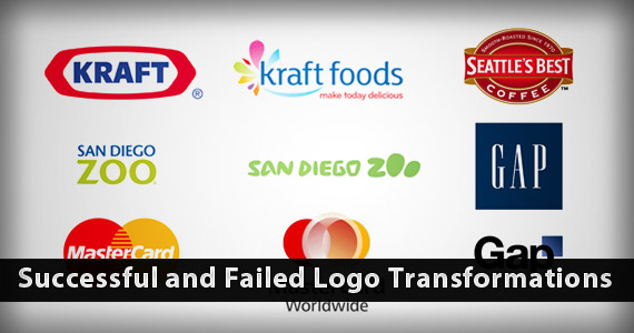
1. GAP

Let’s first cover the biggest company redesign mistake: Gap. They released their new logo last year, and it was a huge disaster. The old logo was well-loved and familiar to all, used for more than two decades. The dark blue square with the familiar serif white font was well-loved and familiar, almost homey.
Gap’s mistake was radically changing everything. The logo was designed by Laird & Partners, in the effort to create a more contemporary and modern expression. Personally I think the new logo is not great, it looks more like a clip art from Microsoft than a “contemporary, modern logo.” I was not alone in this opinion. There was a public outcry when it was released online, major backlash and criticism poured on Gap’s Facebook and Twitter page. Some harsh criticisms include: ‘looks like a child made it’, ‘a joke’ and ‘amateur’.
It only gets worse. Gap chose to remain silent about all the controversy, when they finally responded it added more fuel to the fire. Gap tried to handle its blunder by covering the whole thing up. Gap posted on their official Facebook page, thanking everyone for their input on the logo. They are ‘thrilled to see a passionate debate unfolding’, and asked the online community to share their designs. They ended the statement with: ‘we love our version but we would like to see other ideas’. People were laughing with disbelief over Gap’s response. They dismissed their error as a so-called social experiment, and still had the nerve to ask designs from others.
The story ends with Gap ditching their new logo, and returning to their old one. Gap president Marka Hansen was fired by execs weeks after the failed redesign episode. Moral of the story? Don’t mess with a well-loved brand and image valued at $4 billion. As the old adage says, if it ain’t broke, don’t fix it!
2. Kraft

Radical changes in logo design almost always imply that something is wrong with the company. Everything about the brand has been changed. From ‘KRAFT’ it became ‘kraft foods’. From an all caps, bold font to small caps in thin, sans-serif typography. A tagline ‘make today delicious’ is now attached to the new logo. More colors are added, instead of the distinct red and blue.
Let’s tackle the good parts first. the new Kraft logo is sleek, soft and more feminine. It looks fresher, maybe a move parallel to their decision to produce healthier products for the family. The old font was blocky, heavy and bold. Yes, Kraft seems to have gone the right direction. However, they should have taken cues from other brands that the radical changing of a logo can destroy the brand’s identity. It just looks like the old Kraft and the new Kraft Foods are totally different companies with totally different products offered.
Plus, don’t you think that the new Kraft logo looks eerily similar to the Yoplait logo?

3. MasterCard

MasterCard has reworked its corporate identity, changing the whole logo and name. It is now MasterCard Worldwide, no longer MasterCard International. The familiar red and yellow interlocking circles are replaced by a fluid, swirly, multi-layer logo. The objective of the repositioning is to show the public their intention to expand to newer markets worldwide. The two circles don’t interlock with the bars, but are connected by a third ring shared by both circles.
I am 50-50 about the logo, but I’m seeing the whole thing as more half-empty than half-full. The logo looks modern and up-to-date but there’s too much happening–too many different colors, too many swirls. And when you think about it, why is the center circle off-center?
Update: The company announced that the old familiar logo will still appear on all MasterCard credit cards around the world. The new logo, on the other hand, will serve as a business platform to connect with their customers, merchants & shareholders through all their communication channels.
4. Seattle’s Best

Seattle’s Best began roasting coffee in the 70s, creating premium US coffee and setting the bar for American coffee culture. It has grown from a modest coffee shop in Seattle, Washington and multiplied to a thousand stores in the US and worldwide. It’s the second largest chain of coffee stores after Starbucks (Seattle’s Best is a subsidiary of Starbucks).
I like the old logo–it looks traditional, yes, but in a good way: it is vintage, cozy and homey; like a home away from home. That’s what I believe a coffee shop should be. Maybe the execs thought the logo is too old-fashioned, detailed and fussy. Seattle’s Best probably wanted to compete with other more accessible and affordable coffees like McCafe and Dunkin’ Donuts. They wanted a logo that is simple, minimalist and clean.
However, they seem to have gone too extreme with their simplicity. At first look, it looks striking–there is good design visually. Great typography, gray border with visually relaxing white space. It looks generic and boring. I’m confused whether they’re serving coffee, or eyedrop products, or mineral water, or house cleaning products. Seattle’s Best maybe the most unusual logo for a coffee shop; if it works for them or not, we have to wait and see.
5. AOL

AOL is now Aol. With a dot. Using a Helvetica font (or a variant of it). It’s an attempt at rebranding to be fresh and hip. Was it successful? Far from it.
CEO Tony Armstrong said their new identity is ‘dynamic’, in time with the website’s move to become a more content-centric and provide a world-class experience to their consumers.
First is their questionable use of font. I used to love Helvetica. It was labeled as the best font created in the 20th century, and has received much admiration and praise in the design industry. But over the years I have grown to dislike the font, just as I have an aversion to Comic Sans. Why? While I appreciate the genius behind the typeface design, it’s always in danger of looking tacky and ineffective–because it’s so overused. Their use of Helvetica is a sign of poor creativity and research.

Aol changes their logo background almost everyday, like Google changes for special holidays. It didn’t do much however–the backgrounds used were cliché and corny.
Aol was one of the first online companies established. For years it has been seen by users as a dinosaur, and has been overtaken by newcomers (Google, Yahoo!) in terms of success. It’s great that they’re starting to do something about it, but Aol’s attempts to rebrand themselves as youthful and fun are off-key. It’s lame, and they’re obviously trying too hard.