The auto industry has a long and lofty history of innovation and style, as well as some of the most recognizable logos on the globe. Although many automobile makers are having financial troubles right now, these companies still make up one of the largest and most lucrative industries in history, with car logos that allow them to inspire brand loyalty like almost no other industry. Here are ten of the most effective automobile logos and what makes them so brilliant.
1. Toyota logo
Toyota wins a logo design award hands-down for having the best car logo on the market right now, simply because they have managed to pack both hidden letters and a hidden meaning in their simple, stylistically appealing motor logo. Looking at the picture, you can see where the letters T-O-Y-O-T-A are hidden in the logo, which few people notice unless told first. The other hidden meaning is that the logo is actually a picture of a thread going through the eye of a needle, another detail that is easy to miss. Toyota began its corporate life as a textile company, so this is a fun homage to the company roots. As a bonus, the circular logo makes viewers feel included.
2. BMW logo
This iconic German automaker’s logo wins a logo design award for being recognizable all over the world. This may be at least in part because the logo hasn’t changed over the almost century this company has been in operation. The meaning of the circular blue and white design may seem elusive until you consider that the company began as an airplane manufacturer. The design is designed to look like the optical illusion one sees when looking directly at airplane propellers. However, the design is simple and abstract enough that it hasn’t needed any changes.
3. Subaru logo
Subaru is another logo design award winner because of the meaningfulness and history of its logo. The Japanese automaker was the first to use a Japanese company name. The word Subaru is the Japanese name for a group of stars known as the Pleiades. This group contains many stars, but the Subaru logo contains only six—five small stars that stand for the five parent companies of Subaru, and a larger sixth star that represents the single unified company. The unusual arrangement of the stars gives a modern edge, while the oval shape around them contains the stars and creates a safe, cozy feeling.
4. Smart logo

The Smart logo deserves a logo design award for having the most simple and intuitive design of any car logo. The Smart logo includes a ‘C’ for compact, which describes the car perfectly, along with an arrow for the forward thinking nature of their target customers. This completely describes the company without being cluttered or complicated.
5. Alfa Romeo logo

Alfa Romeo gets an automobile logo design award for including a lot of history in their logo. This Italian car maker’s logo is made up of the Milanese coat of arms, which goes back to the time of the crusades. On the right, a snake eats one of the historical enemies of the Milanese, the Saracens. Because this company prides itself on its history and national heritage, the Alfa Romeo logo is representative of a core company value.
6. Elfin logo
Elfin wins a logo design award for having a logo that is tied completely to their name. While many carmakers choose to use symbolism and history as the theme of their logos, the Nikon-owned Elfin chooses a happy looking elfin creature surrounded by a circle. The circle is not only reminiscent of a wheel, but it also is a symbol of inclusion. The ease of recognizing this logo makes the Elfin logo a clear winner.
7. Audi logo
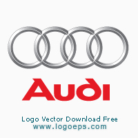
Audi has another car logo with a long history behind its logo. There are four intertwined circles, which actually represent the four companies of the Auto-Union consortium that formed this European auto maker. Because there are also four wheels on the automobile, this logo ties in to the industry the company serves.
8. Land Rover/Range Rover Logo
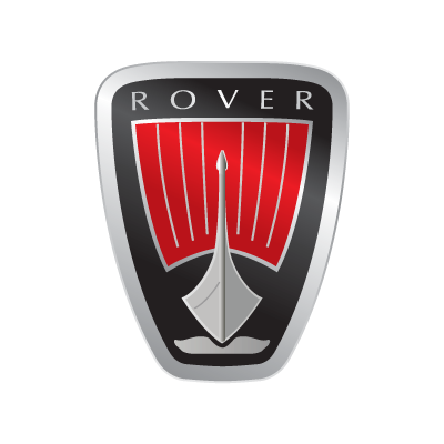
The Rover car company deserves a logo design award for hiding their symbol in very plain sight. Many people don’t realize what the Rover logo represents, but it is easy to see if you know what you are looking for. It is a Viking ship, as Vikings were some of the first European adventurers. Because Rover is trying to portray an outdoorsy, adventurous image, this is a very appropriate subject for this logo.
9. Volvo logo
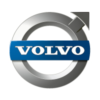
The name Volvo comes from the Latin phrase ‘I roll’. This is a highly appropriate name for an automaker. Further, the circle in the logo goes along with that sentiment. Not only does the logo tie into the name, this circle and arrow is also the traditional map symbol for steel, traditionally the main ingredient in the automobile. This symbol happens to be very similar to the traditional symbol for ‘male’, which gives the car an image of masculine strength. Volvo deserves a logo design award for coming up with such a unique, personalized representation of their history and their values.
10. Opel logo
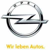
The logo for Opel has always had an ‘O’, but what is inside that O has changed throughout the ages. The first logo showed a dirigible in the circle, which represented the German engineering prowess. This later evolved into an automobile. However, the last symbol change yielded a lightning bolt, which will keep the company from having to change their logo every time the main method of transportation changes. This is a very inclusive logo, but also one that denotes speed and grace.
As you can see, most auto logos are not thought up randomly, but rather carefully chosen to represent the companies’ core values and long history. The fate of many of these iconic automobile companies is still in question, but their car logos remain excellent examples of appropriate and aesthetically pleasing design. If you want to learn about logos, examining these highly successful, highly effective ones is a good place to start.
Suorce: logodesignworks
